deccatalkingpoints@decdesign.com
The Latest Trends in Visual Design

Rapid shifts in technology directly affect marketing strategies. Increased emphasis on mobile platforms, social media and interactive digital content means that the B2B marketer must consistently incorporate effective design that works across all channels.
Here’s a look at some of the visual design trends this year:
Typography
The current trend is to use bolder typography and larger fonts with fuss-free sans-serif styles. The goal is to understand what the information is about in a matter of seconds.
One of the most interesting recent developments in typography is the emergence of services such as:
Script fonts are also making a comeback because of their enhanced legibility and their fun yet classic aesthetic.
Imagery
The latest trend has been to condense content into visual summaries – think infographics. Animated GIF images are slowly making a comeback. As well as being browser friendly, the GIF images are easy to use compared to Flash images and can still provide a dynamic effect.
Design
While minimalism is nothing new, the trend now is to clean and simple design. Most designers agree that simple graphics in a striking composition result in a greater sense of the overall message.
The idea is, as Ginny Soskey of Hubspot puts it, “Design, layout, and positioning can all help you convey your product’s message and drive lead conversions without the complexity of a lot of copy.”
The overall trend is to responsive design. That is to say it is more important than ever to be responsive due to various screen sizes of desktops, laptops, tablets and mobile phones.
Colors
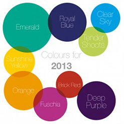
Color trends for B2B branding and marketing are favoring the “simple and bold” theme. Most companies are choosing or updating their signature color palettes in favor of simple, flat styles and bold colors that integrate well with mobile style interfaces.
While maintaining the colors that signify industry and type of message the audience receives, vibrant or intense shades of those colors are yet another design trend in 2013. Large, transparent blocks of color with contrasting hues are also popular.
Take a look at this article and examples from HubSpot. It provides some excellent examples and descriptions of B2B visual marketing trends: http://blog.hubspot.com/b2b-visual-content-examples
